
Efecto De Sombra Atras!
HTML
Publicado el 16 de Enero del 2015 por Luis-miguel- (12 códigos)
12.225 visualizaciones desde el 16 de Enero del 2015
Podremos crear fantasticos efectos de sombra, con muy pocas lineas de código.
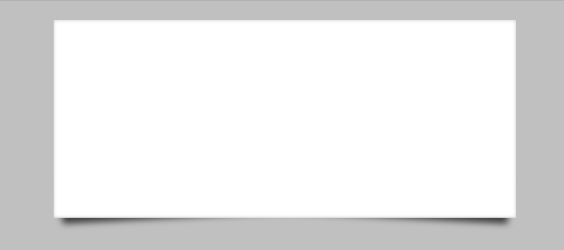
Crear cuenta(4)<!DOCTYPE html>
<html lang="es">
<head>
<meta charset="UTF-8">
<title>Document</title>
<style type="text/css">
body{background-color: silver;
} #caja{
position: relative; width: 700px; height: 300px;background-color: white;
margin: 30px auto;box-shadow: inset 0px 0px 5px rgba(0,0,0,0.2)
} #caja:before, #caja:after{
content: "";
position: absolute;z-index: -1;
} #caja:before{
width: 50%;
height: 25%;
left: 10px; bottom: 15px;box-shadow: 0px 15px 10px rgba(0,0,0,0.7);
-moz-transform: rotate(-3deg);
} #caja:after{
width: 50%;
height: 25%;
right: 10px; bottom: 15px;box-shadow: 0px 15px 10px rgba(0,0,0,0.7);
-moz-transform: rotate(3deg);
}</style>
</head>
<body>
<div id="caja"></div>
</body>
</html>
Comentarios sobre la versión: Html y Css (4)